The “Region of the Transborder Trousers” is a graphical design representing the quality of life of the residents of Tijuana and San Diego. Rather than being a political critique showing that the international borders are unsecure and that there are over 100,000 daily crossings, the art focuses simply on aesthetic experience of new innovative technologies. Mark Tribe and Torolab members wore GPS transmitters and for five days, took different routes in their vehicles to and from Tijuana and San Diego. During their experience, they recorded their fuel consumption. Afterwards, they fed all their data into a computer system that analyzed the data and prepared it as an animated map. Each member was a colored dot with a circle around it whose diameter symbolized the fuel in their tank. The dots moved on the map in correspondence to where the members traveled. The map animation was then compressed so that the animation only last eight minutes in duration which is about 900 times faster than what it really took to run the experiment. Again, this artist (Mark Tribe) is an interdisciplinary artist much like Mel Chen. I think the neatest thing about contemporary art is that you have all these new applications for art such to prove ideas or support hypothesis. Even if art is reaching new innovative, theatrical functions, contemporary art still maintains the sense that it is art. Meaning that art still has this creative and ingenious way to capture people’s attention and occupy the human mind in an entertaining sense so that it’s still like traditional art, just transformed. But by giving contemporary art this new twist, or transformation, we value art on so many more levels.
Thursday, May 7, 2009
Wednesday, May 6, 2009
“The Visual Thesaurus” (Artist 10)
“The Visual Thesaurus” is simply a thesaurus with the same theatrical function except more theatrical considering that “The Visual Thesaurus” rearranges all the associate words into a web. Despite such transformation, I do not think “The Visual Thesaurus” would actually be any more beneficial than using a regular thesaurus online. If anything, the “The Visual Thesaurus” evokes frustration when you have to associate the words to a certain color and then look up the definition which is only displayed when you put your cursor over a dot and make sure you are looking at the corresponding word’s definition. Additionally, if you look up a word with a lot of associated terms, the web gets crowded and the words overlap and then you cannot read all the words that are displayed. I would simply just use a regular online thesaurus such as dictionary.reference.com especially since the programmers want you to pay to use the “The Visual Thesaurus.” In totality, this I think this is bad art and clearly the "process that drives the painter" is money.
David Crawford's Stop Motion Studies (Artist 9)
David Crawford’s work seems to be quite bizarre considering his “Stop Motion Studies” take place on the subway and each person in his work, is part of his art. Crawford’s work foregrounds a multitude of human interactions to show that 90% of human communication is non-verbal. By doing so the viewer picks up on the all the body movements and gestures humans make. I would feel uncomfortable if I was a piece of someone’s mass art project especially when the person taking the picture is someone I don’t know. There are some clips of some people sleeping and usually they are close ups, I just think that those people taking the pictures are “creepers.” Regardless of the situation, Crawford’s work shows that 90% of human communication is non-verbal and further goes to show that interaction between people are decreasing as digital technologies play increasingly higher roles in individual’s lives. If you observe the people, most of the people either perform for the photographer or ignore what’s going on. Either way, most of the people on the subway ignore each other and pretend or are preoccupied in their digital technologies. This is important because the subway brings people of different social and cultural backgrounds together, and if people of different societies and cultures cannot react with each other, we see that the city’s character is changing for the worse. What is most odd is that David Crawford uses art to show this! You can say Crawford is an interdisciplinary artist like Mel Chen and his work has a theatrical function.
The "Industrious Clock" (Artist 8)
When examining Yugo Nakamura work, I fist thought, “this website is just a clock; why use this “Industrious Clock” when I have my own clock on my computer that is just as accurate?” Then I noticed this clock, unlike my computer clock is embellished with art. This clock uses the internet as its medium and foregrounds a bunch of numbers into a pattern that we observe as a digital clock. However, each number is not foregrounded against some empty space, it’s foregrounded against what appears to be lined paper. In addition, the numbers looked hand written. In fact if you examine the numbers, you see that every time one changes, the page flips and someone draws the next number in the sequence. Like mentioned above, the “Industrious Clock” is just as accurate as the clock on my computer. I wonder what if I go to Germany and I visit the same website where you find this clock (http://yugop.com/ver3/stuff/03/fla.html), will it read Germany’s time or Eastern United States’ time? This was one of Yugo earlier works. I came to find out, Yugo is actually a very talent digital designed. To see some really interesting stuff of his click here.
Response to Artists Talk, Monotypes
I went to an artist talk/panel on developing skills for creating monotypes. I had never created a monotype till then and was very intrigued by the way you actually create one. So pretty much you take any size of Plexiglas and round off the corners. Then you bevel the edges with a rough file at a forty-five degree angle. Then you start painting the image you want displayed on the Plexiglas. However, you paint the highlights on first and all the darker colors on last. So really, you are painting a picture backwards (compared to painting something directly on canvas). Furthermore, the more color you put on the Plexiglas, the better the final product will look. After you complete painting the picture, you soak a piece of print-paper in water for ten minutes or so. Afterwards, you dry with a towel and rub it slightly to remove its sheen. You then place the paper on the Plexiglas so that the paint seeps into the paper. With a rolling pin, you then press down on the Plexiglas so that the paper takes in all the paint; however, you do not want to rub the Plexiglas and paper together so that you would smear the colors and layers of paint. Lastly, you can take a wooden spoon and burnish the paper. By doing this the paint from the Plexiglas gets displaced onto the paper, which is your final product. The image looks quite unique compared to other methods of painting and you cannot replicate that same image twice. Conversely, with the left over paint on the Plexiglas, you could make a ghost copy of the image. To do this you simply soak another piece of paper and displace the leftover paint on it using the proper technique mentioned above. This image will look slightly like the original version but lighter, hence it’s ghost copy. All in all, this artist talk/panel on creating monotypes was very intriguing. She mentioned that there was a difference between monotyping and monoprinting but still did not comprehend what was the difference after her lecture.
Response to Artists Talks, Art Studio Exhibition II
I attended Ya Haddy Njie’s, Emily Norris’s, and Bonnie Veblen’s Art Studio Exhibition II. It was intriguing to me to see such magnificent art and have the artists there to explain what their art meant to them.
Despite what they said there art meant to them, it was hard not to draw your own interpretations. For instance, Ya Haddy explained that her art was a search for her identity and a way for her to express how past experiences have contributed to creating a false identity for her which she has been constantly fighting so that she can create her own identity. When I examined her art, I saw the intense emotions she felt coming from the expressionistic depiction; however, if I was not given the background information I would never have known that her art was describing her internal struggle to develop her own identity. In fact, I would have only known that her art was to express some sort of frustration because her work was only black and white with varying forms of harsh lines composed in different layers that seem to symbolize anger. It was odd though that Ya Haddy had pointed this out in the insert that was distributed at the show. In the insert, Ya Haddy states that her “symbolic expressions sometimes appear to be a portal pulling my viewers in and other times act as a barrier, stopping the viewers from knowing anything beyond that point.” It was also unique to see art presented in new ways which I have never seen. Emily Norris’s work used sharp, geometric edges to separate fluid and irregular objects. By doing this, it was like separating reality with some unreal parallel universe. The non-real, real images had some potent, perplex energy to them that captivated me. Lastly, it was very pleasant to view the nourishing artworks of Bonnie Veblen. Bonnie’s art was very nourishing because it was able to exemplify nature’s serene beauty and create a connection between you and nature. In other terms, the work itself was so powerful that you got lost in it and like a dream you were surrounded by nature and its presence (almost like reading a good book and being able to visualize everything taking place). The connection between me and her artwork was probably stronger than the other two artists because there is more I can relate to. When you see a picture of a tree, you know exactly what the picture is of- a tree. So when examining an oak tree foregrounded against a soothing, naturalistic setting, you are immersed by a pleasant, naturalistic sensation.
In totality, the Art Studio Exhibition II was very astounding and surprised me what great artists we have here at SMCM.
Plant Sperm Everywhere! (Scrapbook 22)
No, this is not a picture of my new car, nor is it a picture of my car. I do not even own a car. This is a picture of my neighbor’s car that just has a whole ton of pollen on it. My left eye has been irritated for the last several days and it’s either because I have an eye infection or because all of this plant sperm is getting into my eye. I would rather the irritation being caused by all of the pollen getting into my eyes than me having an infection because then I have to go to the doctor. I am not scared of the doctor or anything, it’s just a pain to have to go there and wait three hours in the lobby to be seen. Then you have to get medicine and drive back home. However, my eye bothers me even when I am inside, so I am not sure exactly what the cause is. My eye does not look infected nor is it bloodshot so no need to put it on display. Just really annoyed that my eye has been bothering me and amazed at how much pollen is everywhere. Those pictures are of a black PT Cruiser, from a distance, the car looks like a shade of gray and yellow. The pictures were not made to be art, just a reference to show how much pollen is out there and give me an idea for what the cause of my eye irritation is.
Charlie's Jelly Beans (Scrapbook 21)
The first picture is of my friend’s cat, Charlie, and the second picture is of some Easter Jelly Beans. Jelly Beans are one of my all time favorite candies and oddly, Charlie likes them too. I found this out when I accidently dropped one on the floor; he sniffed it, and then ate it. I doubt candy is good for the cat so I did not feed the cat too many (only three beans in total). Just a side note- Charlie is pretty old, I think he is probably fourteen or fifteen years old but he looks and still acts like a juvenile, frisky feline. Luckily, the cat was still acting fine after consumption and it was lucky for me that no one saw me feed the cat. Lastly, Charlie did not ever really search for the container of Jelly Beans on the table after I fed him. It probably is a good thing that I did not cause the cat to develop a bad eating habit. I just found it really amusing that a cat eats Jelly Beans so I just wanted to show some people of this comical discovery. Actually, in the picture with Charlie, Charlie is eating a Jelly Bean but I do not think you can tell from the picture. So these pictures were not meant to be art, just something for laughs.
Eastern Tent Caterpillars or Gypsies (Scrapbook 20)
Here is a picture of some Eastern Tent Caterpillars in their tent nested in a cherry tree. Most of the time, the Eastern Tent Caterpillars are confused for Gypsy Caterpillars. Gypsy Caterpillars are known to defoliate entire trees and destroy large percentages of forests. Furthermore, Gypsy Moths usually consume our beloved fabrics and hence moth balls were invented. Despite the fact the Eastern Tent Caterpillars are not Gypsy Caterpillars, they still are bothersome pests because like all caterpillars, eat leaves. Thus by having a mass of Eastern Tent Caterpillars on a cherry tree, the cherry tree will probably be completely defoliated unless someone deals with the caterpillars. The easiest way to deal with these pests is to get a long stick, poor some gas on the end of the stick, light the stick, and light the nest. There are probably some pesticides that would do the trick but that would require you to go out to the store to buy some. Furthermore, most of the caterpillars fall off the tree before dying and just climb their way back up. So if you use pesticides, make sure to by plenty of it and try not to breathe it in yourself. Using fire is not that safe either, because you can always burn the tree or get your lawn caught on fire. Regardless of what strategy you use to take these suckers out, the main purpose of this picture is to point out that these are caterpillars need to be exterminated even though they are not much of a hazard as the Gypsy Caterpillars. (This picture is not art, just a picture telling to be warned about the defoliating menace. The picture was taken in Chestnut Hill's park)
Dogwood Tree (scrapbook 19)
This is a picture of a dogwood tree in my neighbor’s yard. The tree drew my attention simply by its beauty. I know it’s dorky, but every time I see a dogwood tree I remember my deceased golden retriever. Let me sum up all my feelings for my dog by saying, my dog, Liberty, was the best dog anyone could ever have. Of course, other dog owners will beg to differ but the point still stands that every time I see a dogwood tree that I remember Liberty. Now, yes the tree is a dogwood tree and the word dog makes me think of dogs but really there is a different reason behind why I think of Liberty when I see a dogwood tree. The main reason is the fact that Liberty was buried under a dogwood tree. So in totality, this picture was not meant to capture the beauty of the tree as a work of art but as a memorial to my dog. I think the reason why I had such a connection with this dog was because I grew up with the dog since I was born. My parents got the dog as a puppy when they got married and well… I came a year and a half after the dog. In addition, the dog saved me from drowning when I was four by jumping in a pond after me and letting me grab on to it, and swim me back to shore. Almost a far fetch story but true.
Picture of a picture of a picture (scrapbook 18)
Even though this is a picture of my artwork, the picture of the artwork was not meant to be art. You see, I was help cleaning out my friend’s pool when I saw this lizard drowning in it. So I picked up the lizard, took a picture of the lizard (which was still on my hand) with my phone, and let it go in some nearby bushes. Later, I drew the picture of the picture and gave it to my friend’s mom thinking that she would enjoy the artwork since she was an artist. This happened several years ago. Now, when I went back to my friend’s house, I saw the picture hanging up on their fridge and took a picture of it just out of impulse. Oddly, seeing that my picture has hung on her fridge for so long made me feel good about my artwork. So yes, this is a picture of a picture of a picture.
Monday, April 20, 2009
Prom Night (Scrapbook 17)
This is probably my favorite picture of all times hence it deserves at least my attention. This photo was actually shot last Saturday, April 18. The beautiful lady kissing me is my girlfriend who I have been dating for 16 months. We are both dressed up for Leonardtown High School’s Prom and we are on Solomon’s boardwalk right outside of DiGiovanni (where we just ate). I have been to three proms before this one and this prom simply bested them all. People say that “your high school years are the best years of your life.” And even though I go to college, the high school prom and being with my wonderful high school sweetheart “made my day,” where certainly “one of those days” make it the best times of your life. So what if it’s a “mushy” photograph, it means a lot to me even though it was not shot to be a work of art. I just think the picture deserves my attention so that I can always reminisce on all the beauty contained in that picture and the wonderful time we had together.
Ponded! (Scrapbook 16)
This must have been one of the best “pond-ings” ever; the girl getting “ponded” is my brother’s girlfriend. For those who do not know what “ponding” is, “ponding” is a St. Mary’s tradition where you get thrown in St. John’s Pond on your birthday. However, my brother’s girlfriend’s birthday is on Easter and she would be up with her family that day. So what we decided to do was surprise her a couple days early. I don’t think I have ever seen someone get so much air and distance off of a throw before; she probably was thrown a good five or six feet out into the water, reaching heights of about five feet above the water before plummeting into the water and muck. It was even funnier that she, my brother, and I had crew practice in ten minutes and Allie who is a national ranked rower, coaches us novice members on some days, and on this day she was suppose to coach us. Thus, she was a little late to practice because she had to throw on some dryer clothes.
These pictures weren’t intended to be art, like most of the pictures I have scrapbooked, the pictures are meant to preserve time so that anyone can look back at the photos and savor the moment. And photos like these pictures deserve our attention so that we do not get too caught up in our studies and works to forget about all the good time we had.
First Regatta (Scrapbook 15)
This was the first regatta that I have ever gone to. This is a picture of St. Mary’s varsity 4+ boat at Occoquan Regional Park, VA. Sadly, I did not get to race in it, mainly because I am on novice team (people who have rowed less than a year). However, it was an amazing experience to see all the training pay off for the team.
This picture drew my attention primarily because it was my first time viewing a regatta and so it will always be a memory to cherish; the picture is actually of Men’s Varsity 4+ sprints. There were so many people there and everything was hectic but that’s what makes it memorable. And like I just previously mentioned, it is fascinating to see how all those 6:00 a.m. practices and hour long erg workouts reflect our performance. This picture was not designed to be art, just to capture the essence of the race, the posture of the rowers (to critique), and to capture the overall moment. In the picture, the rowers are at the “finish” position at the starting point and each rower has correct posture. In this particular event, St. Mary’s got second place. I just have to hand it to the team and coaches on how well we did.
You can also find results here
Sunday, April 19, 2009
Rapunzel and LOST
“Rapunzel,” the fairy tale, was first published in 1812 by the Brothers Grimm. Today, there are several versions of the story that exist, most of which were designed for children’s ears. However, William Thompson believes that despite the simplicity of the story, there actually lies subtle, complexities of the story that create different levels of meaning; in totality, there are four levels of a story: literal, structural, anthropological, and cosmological.
The simplest level of the story is the literal level, where everything is denotative. From the literal level you can sense patterns in narration. These patterns form the structural level of the story. For example, in “Rapunzel” one gains the sense that everything comes in sets or pairs. This is implied with the presence of the father and mother, Gothel (sorceress) and Rapunzel, the King and the prince, the twins Rapunzel gives birth to, and finally the complete union of Rapunzel and the prince. On an anthropological level, “Rapunzel” implies how a weak and unstable patriarchal society can be overrun by a matriarchy, but in the end the best relationship is a stable patriarchal society in the realm of Kings; however, for this patriarchal society to be stable you must have a unique balance of power and love between both sexes. Last but not least, there is the cosmological level of “Rapunzel,” were the story sets up order of the planetary systems. A Rapunzel is scientifically known as the Campanula rapunculus, a fivefold flower (five petals). Given the plants appearance, the character, Rapunzel, is portrayed by the planet Venus. If you ever observed Venus drift in the sky and connect the dots, it would make the shape of the Campanula rapunculus petals. Now you could dissect each and every story you have ever heard into these four levels.
Let us dissect “LOST” into these four levels. On the literal level, the story follows the lives of the survivors of a plane crash taking place on an uncanny, supernatural island. Structurally, you see that each person has their own problem, where the problem originated, and yet each problem cannot be completely resolved, just slightly improved. For example, Hurley won $144 million off of a lottery number; however, this number was not exactly randomly generated by Hurley. These numbers were seen by Hurley during his stay at a mental institution of which one of the insane people kept painting on a canvas. Ever since Hurley won the lottery, he has only been brought bad luck and many people involved with or around Hurley start to die. As a result, Hurley blames himself. Once crashed on the island, Hurley is faced with the several curses. In one instance, Hurley initially stashed a lot of food for himself, but feeling guilty for hording food and being so fat, he has his friends help rid him of the food. He comes to find out that there was a food drop from the night before. Hurley breaks away from his friends and restarts his bad eating habits. Again, his friends come to his rescue and help him reason. Even though Hurley solved his eating problem, he is still stuck on the island, which is still full of unwelcomed surprises. “LOST” is such an immense, detailed, and powerful story it is hard to accurately articulate every idea so when it comes down to looking at “LOST” at anthropological and cosmological levels, it probably would be better to generalize several theories. On an anthropological, “LOST” is all about how different people of different races must cooperate to survive and how you cannot have anarchy if anyone wants to survive. You see that order is only obtained when Jack is the leader of the survivors and you see how people like Jin and Michael must cooperate to get off the island together (even though their attempt fails). On a cosmological level there are so many people that groups of people can represent plants. There are the messengers, supporting actors, who represent Mercury (“the busy planet”). There are the main actors, who represent Earth and its fragile state, and the “others” (and other living evils) who represent Earth’s moon. I believe that the evil represents the moon because the moon is always orbiting the Earth and always has affect on the Earth’s systems and no matter what, we cannot not get rid of the moon without completely getting rid of us. Last but not least, the mysterious island represents the Sun which is the center piece of our solar system, and drives both creation and havoc on Earth.
Tuesday, April 7, 2009
reflection/response for Art21
Some artists’ techniques always fascinate me more than other artist’s techniques. I have always enjoyed creating drawings and making very precise, objective works; and when I view other artists’ works, I usually prefer to see more of the Chuck Close styles than Alberto Giacometti styles. Despite, the fact that some works preserve almost every single detail even if the work is transformed, I do not look for the artists’ reason or objective behind their work. I just simply like to enjoy their work. So why don’t I like abstract art as much? Typically because I feel that more effort is put forth to preserve every lasting detail and impression rather than just slop some paint on a canvas and call it art. I never said it did not take Giacometti hours to create his sculptures or drawings; I just did not enjoy looking at sketches that even I could have created. So now I want to give you an idea what I think about several artists I learned about during the Art21 viewing.
The first artist I viewed was Sally Mann. Her photographs were extremely exquisite in such a way that her photographs persevered almost all the detail in her pictures and yet gave them that old, historic, 1930 glass plated appearance. She was always spontaneous, and her work was like “her bible.” In fact, she had such a strong passion for her children and her work that she used her children as the center piece of her work. I liked her work because she was so dedicated to make her photographs perfect that they pretty much were. The next artist, Mel Chin, can be considered an interdisciplinary artist. His work is very admirable and ingenious. He takes decrepit, ruined houses and transforms them into something of worth and gives value to the city. Mel is also involved in preserving nomadic cultures by incorporating real nomad carpet patterns into a videogame that has you trying to figure out puzzles and you ways out of labyrinths for particular nomad tribes. Last but not least, he works on the revival field, which I think is the coolest art project ever. The revival field was designed so that plants called, “hyperaccumulators,” can take high concentrations of metals out of the soil allowing other plants to survive. The hyperaccumulators actually would absorb the metal into their system and be able to be harvested so that the metals could be recycled. What is cooler than a plant taking metals out of the soil and refining the metals by itself so that it can be harvested and allow the surrounding environment to sprout life in a once toxic wasteland? James Turrel is the third artist I evaluated. He is an environmental artist and an architect. His heart seems to be pure seeing as he designed a meeting house for Quakers and has been working on his Roden Crater Project for years, both which have been created to bring inner peace. With much dismay, the Roden Crater Project has caused Turrel many financial problems and consequently cost him two marriages and a relationship. I would at least wish him the best of luck of finishing the Roden Crater Project which already looks spectacular despite not being finished. Last but not least, I looked at Jabriel Orozco’s work. You could almost say that Jabriel is an inventor or a very abstract artist (except this is the type of abstract I like seeing because he is not the typical abstract artist who only paints or draws). Jabriel takes different mediums into different spaces and invents something total new. For example, he took potatoes and put them on books in a store and he took cat food cans and put them on watermelons (which I find very amusing). Let alone the fact he designed a cool looking car (even though it’s not functional), a clover-shaped ping pong table that four players could play on with a pond in the middle, and a circular billiard table with one ball suspended from the ceiling. The most outstanding concept behind his work is that he uses tools that everyone could use and yet, somehow, he makes masterpieces.
Perspective Students (Scrapbook 14)
Simply, this picture was taken inside my room after I just ate lunch at the Campus Center. On that particular day, there was a ton of perspective students all around campus and at lunch time, they flooded the Great Hall. Consequently, I had to wait in line for fifteen minutes just to get a crape. I was not annoyed that I had to wait fifteen minutes in line, just bored. Oddly enough though, the positioning of my “freshman” lanyard (with my ID) on top of my antique high school sweatshirt reminded me that I too was a perspective student just last spring. (A note about the “freshman” lanyard- only freshmen wear them, and usually, the freshman would stop wearing them by the first week of school so that others would not associate them as freshmen.) This picture is not art, just coincidence; it’s not that unlikely for a messy teenage boy to throw his belongings on top of more of my belongings.
google earth link
google earth link
Firsts and Lasts-Smoking (Scrapbook 13)
This picture was taken outside of Dorchester. This is a picture of me smoking my first and last cigar; I will not even bother trying a cigarette. The social aspect of smoking such as hanging outside with my friends on a late night was fun, and being able to say that I have smoked once in my life is fine, but for me, once is enough. After smoking I had to brush my teeth for a good five minutes and wash my mouth out with some Listerine before my mouth even felt remotely clean. After that I had to shower for ten minutes before feeling clean. And just as bothering was the fact that my clothes smelt and made my room smell so bad that I had to put my clothes straight into the washer. It was even worse when I could not fall asleep because I was coughing pretty bad and had to take a cough drop. I do not want to rant about all the negative consequences of smoking but simply note that despite being the health freak I am, I actually did smoke a cigar. So now I can check that off my “things-to-do” list.
google earth link
Wednesday, March 18, 2009
Digital Pictionary Project Response
The Digital Pictionary Project was very intriguing and showed us our own ingenuity potential. I enjoyed making the collages but it was even more amusing evaluating others. While evaluating others’ projects, you could also analyze the artists. Through the works, you could guess the word that the collages were designed to represent but in totality you could see how the artist thinks. It is odd to see how each artist thinks on their own scale despite limitations. So all in all, this was a great project.
Tuesday, March 10, 2009
The Voronoi (Artist 7)
In the Voronoi, Daniel Shiffman uses a software program that computes a Voronoi colored diagram via a video camera. In regards to the camera’s perception, the Voronoi diagram program will translate the real life image into pixels and then into tiles that reshape themselves and move accordingly to real life movements. From my understanding, the Voronoi diagram program sorts real space into certain compositions or sections based on the distance away from a specified set of points and then displays them as their own tile and by moving a certain section of the image will move to a different tile. In a way the program uses its audience as its content, and furthermore, the program transforms and then foregrounds its audience using some sort of relative scale. What really is interesting about this piece of art is that the image starts off very distorted and skewed but then transforms into something that is recognizable. At times, the work creates suspense by making you think how the image will turn out and by doing so it also evokes a sense of curiosity. Personally, this is my favorite piece of work I have reviewed up to now. The Voronoi is certainly a masterpiece which all can enjoy. Oddly enough, the software program that computes the moving tiles of the Voronoi diagram was based off principles that have been applied since 1644 ( through applications of Rene Descartes). However, the Voronoi diagram was actually conceived by Georgy Voronoy in 1908. If you want to check out a video click here.
Monday, March 9, 2009
Finally, A Nice Day (Scrapbook 12)
Even though it’s still winter (I think the season ends on the 22nd of this month), St. Mary’s County finally received some good weather. I saw some people tanning out in the sun, others biking around, people reading in the shade, and this fellow skateboarding. This picture was taken right outside of Dorchester and was the only shot I was able to get of him jumping over the bench. I just thought that he had some wicked talent; the picture itself was not designed to be art. The photograph just shows us that it was a good enough day to do anything that we wanted to. Well until six o’clock or so when the temperature dropped around twenty degrees. At least there is only four more days till Spring Break and hopefully by then, it will have warmed up.
Baldies for Boobies (Scrapbook 11)
Our college was quite successful at raising money for cancer research and cultivating enough hair for wigs for the people who need them. Even though we are all poor college students, we were able to raise over $400 dollars and cut off 373 inches of hair. This was all done in one day (March 7, 200) in front of the campus center. Here is a picture of one couple who helped make “Baldies for Boobies” a huge success (the name of the fund raising campaign). Overall though, we should thank GJL for getting everything organized and hope they keep up the good work. This picture is not art because one- it’s a picture of my brother and his girlfriend (just joking), and two- it is only meant to signify the achievement GJL made in supporting a good cause.
(the picture was taken inside a dorm room, but this link shows where “Baldies for Boobies” was held)
Thursday, March 5, 2009
Tuesday, March 3, 2009
Uli Franke- The Hektor (Artist 6)
Uli Franke developed the Hektor for his diploma project (at école cantonale d'art de Lausanne) way back in 2002. In theory the Hektor is a large printer capable making any design; however, this printer uses only a spray-can to apply its toner instead of using LEDs, lasers, or inkjets. The spray-can is put in the can-holder that uses two motors and toothed belts to move the can in any direction in one plane. The Hektor is linked to a laptop and runs off the software program known as Scriptographer (Adobe Iluustrator). The Hektor foregrounds an artist’s own content on its given form. However, the Hektor itself is its own unique individual piece of art. The Hektor was created to evoke people’s interest and allow other artists to experiment with a newly conceived tool. This forces people to go outside the realm of displaying images on computers to create abstract geometries displayed the almost the same way the average day printers do. Unlike, the tiny printers we have, the Hektor shakes and quivers to produce a low-tech aspect to the high-tech applications used to design the preliminary image on the laptop. This overall though, evokes gentle and soothing sensations, and creates distinctiveness in all the art it creates. Personally, I wish I had one of these; I would be able to create art anywhere. I would probably decorate my own dorm room with it. Thanks to Uli Franke’s masterpiece, we can make masterpieces of our own. I may download Scriptographer offline, supposedly it’s free; I just wonder how much the Hektor costs. (Watch Videos)
Ben Hansen and Ben Rubin, The Listening Post (Artist 5)
Mark Hansen and Ben Rubin have created a very astounding and magnificent piece of art using the Internet as their content. Unlike their most common predecessors, Mark and Ben transferred the outside people’s words into their own. So their picture, actually their artwork, definitely consists over a 1000 words, which is cumulatively called the Listening Post. The Listening Post uses segments of text which were written by people in unrestricted Internet chat rooms, blogs, and a variety of other internet public forums, as their content. The content is formed and foregrounded into a suspended grid of 200 plus small electronic screens. With the use of a voice synthesizer, the content is sung while being displayed across the screens. There are content is displayed through six movements like pieces of a symphony. Each movement has different: visual arrangements, audio enhancements, music elements, and data processing logic; each movement evoking a separate emotion. Initially, I thought Ben and Mark’s work is handicapped by the lack of innovation because they couldn’t create their own content and instead used the Internet as a crutch to find their content. However, after youtubing their work, I thought their work was a unique marvel. “I am”…amazed.
Crazy Ducks (its snowing still) (Scrapbook 10)
Originally I took this picture not thinking much of it, but when I examined it today, I thought those ducks must be crazy. This water must have been close to freezing the day they were swimming in it because the next day it was frozen over. You always imagine all the ducks migrating south for the winter or at least flying away from storms because their instincts kick in. Well these ducks have been here all year long (well at least every day I have been on campus). So I tried to see why these ducks do not migrate. I assume that they probably don’t because they don’t need to. But personally, I would rather go where it is warm than stay in the cold even if I could survive through the cold conditions. I assume that these are ducks must be one of the following: American Black Duck, Gadwall, or a Mallard. I am not so sure though.
google earth link
Blizzard of March 1-2, 2009 (Scrapbook 9)
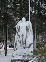
Two weeks from Spring Break and we got a whole 10 inches of snow. This is St. Mary’s County too! I can hardly believe it. It was almost a new record low for the amount of snow we received in a given “winter” until today. So I spent today trying to build an igloo which only turned out to be a cruddy 4ft high fort (with a radius of 4ft from the center). I spent four or five hours on it before I had to go to dinner. But before that I took this picture; I haven’t seen a statue like this since I have been up to Rome, New York. Pretty cool if you ask me. How does the snow stick to the guy’s stomach anyways because that is an approximate 85 degree angle? Just lots of tough bonds between all the molecules I suppose.
google earth link
google earth link
Boathouse's Finest Look (Scrapbook 8)
A lot of the locals and teachers of St. Mary’s complained about building a boat house on the river’s shoreline claiming how it would obscure the gorgeous view of the water. Well, if you don’t think this picture shows the beauty of the environment despite the boathouse, you’re crazy (in the most positive way of course). The reflection of the boathouse in St. John’s Pond is actually quite outstanding, the sunset is amazing, and how the snow creates a soft white blanket on everything it lays on top of is really eloquent. So in totality, I took this picture to show how beautiful our campus is and to show how insignificantly the boathouse’s presence affects us.
google earth link
google earth link
The Frozen Bicicle (Scrapbook 7)
This bike was found right outside of Dorchester. I am pretty sure this bike won’t be going far anytime soon. It just shows how much some people care about their valuable possessions. Even if the storage bike room inside Dorchester was full, they could have at least brought their bike in their own room before the storm. My roommate had to bring their bike in our room several occasions and it wasn’t really that bothersome. But really, this dilemma drew my attention because all the icicles hanging off of the bike made it look really neat and because the bike was stuck in place made the situation funny.
google earth link
google earth link
Sunday, February 22, 2009
Safety First (Scrapbook 6)
I think it is safe to assume that St. Mary’s is probably one of the safest campuses in the United States; the only real dangers are the crosswalks and natural hazards. We proposed to build a bridge over route 5 to eliminate being hit by oncoming traffic; however, this idea was shot down. Despite this, we can still ensure crosswalk safety by deploying P.S. on the roads. So what do we do to ensure our safety from the harm of natural hazards? St. Mary’s has regular inspections of its safety equipment required by Maryland State Law. It seems kind of silly to mention because don’t all schools follow state laws and check their safety equipment. The answer should be yes, but have you ever needed a fire extinguisher and picked one up to combat the fire but the extinguisher did not work because it was outdated. Well I have! Luckily, the fire was in the very portable vacuum I was using and so I unplugged the vacuum and took it outside on the pavement (then I tried to use the extinguisher). Even though the extinguisher did not work, the fire died down quickly and there wasn’t really any real damage to it besides to the belt of the machine. So it was a relief to see that St. Mary’s fire extinguishers were checked and that the old ones were replaced. So why isn’t a fire extinguisher art? Like the water fountain, a fire extinguisher only has one purpose, to put out fires. A fire extinguisher does not represent anything, does not narrate a story, imply any hidden meanings, evoke any emotion (unless its gratitude when it comes time to use one and it saves your life), does not depict a story, etc.
google earth link
google earth link
P.G.'s Sanitary Water Fountain (Scrapbook 5)
This is the overview of a water fountain in Prince George’s Residence Hall. I probably use Dorchester’s water fountain over seven times a day, occasionally to fill my 20 oz. water bottle. Like I said, this is a picture of P.G.’s fountain, not Dorch’s. I got thirsty while playing Frisbee Golf and decided to use this fountain. No, I did not have the camera with me at this time but I came back to take a picture of this wonderful, sanitary fountain. Now for all of you that have been in Dorch, and have been acquainted with its disdainful, unique smells, and the piles of garbage, and the bathrooms sinks clogged with who-knows what, you start to value clean and sanitary objects (especially when you get sick a lot from living in there). So, a clean water fountain I could drink out of was very pleasant- I did not have to look at anyone’s spit caught in the drain, or hair for that matter, nor did I see any food particles or Ramen Noodles stuck in it; there was no mold either. So in totality, the sanitary fountain provides me water, which helps me sustain homeostasis, which makes me happy, and I do not have to worry about getting sick when I drink from it. The fountain itself may be a plain fountain, and is definitely no work of art, but it is important to at least note that at least somewhere outside of Dorch, there is a clean fountain people can drink out of. If someone wants to argue that this water fountain is a work of art, they can by posting a comment. But this fountain has only one purpose- to provide water. It is not designed to entertain, it is not a sort of medium, it does not depict any hidden message, nor does it evoke any emotion; it is just a simple device.
Ken Goldberg's Art of Disbelief (Artist 4)
Ken Goldberg, one of my favorite telepistemologist (one who studies nature of knowledge through mediated sources like the internet) developed the Telegarden. The Telegarden uses the internet as its medium to promote its audience to command the real industrial robotic arm to maintain a garden. Even though the garden and the robotic arm are real, Goldberg’s main purpose is to evoke disbelief. Goldberg has assumed that media technology suspends disbelief but Goldberg wants there to be that sense of disbelief. I believe that Goldberg still wants his viewers to be suspicious and awe in disbelief of his accomplishments. In sense, making a work of art that is so amazing that it is too-good-to-be-true increases value of his work. If viewer believes that his artwork is just as real as any other media technology, then the two media technologies are equal to each other. Have you ever seen the Disney movie, Road to El Dorado? The two main characters, Tulio and Miguel, were viewed as Gods to ancient (Aztec, Inca, or Mayan) civilization because they appeared too-good-to-be-true. In terms, Tulio and Miguel represent Goldberg’s work to the vast majority of audiences. However, if the tribe people saw that Tulio and Miguel were ordinary people from Spain, they probably would have tried killed them just as Tzekel-Kan did (who knew that they were not Gods). So if Goldberg’s work was seen as the Gods but then discovered to be just ordinary, then well, his work would be lame and pointless.
After Life, the film
The film, After Life, might have been one of the most outstanding and creative movies I have ever seen. However, if you do not enjoy long or complex movies, this movie is probably not for you. The movie revolves around a special office building in which newly dead spirits are sent to. The spirits are not the typical ghost we usually imagine, but just an ordinary being. These newly dead people have to pick their most significant memory to take with them in their afterlife and only this one memory. To facilitate the memory picking process, there are a set of counselors to advise them; these counselors are also dead spirits but they have not picked a memory to take with them to the afterlife. Thus they are stuck to help the newly dead. After the dead people pick a memory, the counselors develop a movie for them. Then the dead watch their movie, and vanish into the unknown afterlife.
The two main characters are Takashi and Shiori, whom are both counselors. Shiori has a secret passion for Takashi; however, Takashi does not have the same burning fire for Shiori. When Takashi counsels one of the newly dead, Ichiro, he finds out that Ichiro married his (Takashi’s) wife after he (Takashi) died in WWII. Ichiro gets placed under a different counselor but Takashi is still troubled by his past memories. Throughout the movie, Takashi questions his love for his former wife and his somewhat interest in Shiori. In the end, Takashi decides to go in the afterlife and chooses to pick a memory of his former wife.
The After Life is creative because the movie does consist completely of actors but improvises with memories from real people’s lives. And oddly, the entire film is in Japanese and as the movie goes on and you read the subtitles, you give the characters specific and distinguished English voices (very strange if you ask me). Also the plot is very out-there and to have such strange situations (as giving the dead an option to pick only one memory to have for the rest of the afterlife, and to have romance between two dead people, the way their lives were portrayed in an old office building, etc) was a masterwork only a genius could design.
Wednesday, February 18, 2009
20 Line Project Response
The 20 line project was certainly a way to test our creativity and our artistic ability. The project was difficult in the sense that you were limited to only using the computer to draw 20 separate lines, each continuous from endpoint to endpoint and the lines could not have any real life representation (such as using 20 lines to draw a house). And we knew that we had to draw our lines better than the other students made us work to be more creative and inventive. It was pretty neat how much you could do with a simple line just by changing its color, size, and conformation to make the line not traditional line. So overall, yes this exercise did in fact make me aware of all the choices that I had to employ to make my art better than the other students (even though, there were plenty of other 20 line projects with more unique lines). By making me comprehend all my options, I was able to enhance the meaning of mine and other artworks; for example, even simple lines can take on an overall form and develop a sense of emotion. I had created over 40 lines before I picked which lines would be suitable for my display. Most of my lines were small bright red, orange, and yellow jagged lines with a smear of blue and purple in the middle to soothe out the violent emotions that the bright lines had brought out.
Sunday, February 15, 2009
Our Trash (Scrapbook 4)
Yes, I did in fact post a picture of our room’s garbage and even though our garbage might be someone else’s treasure, our garbage will still be sent to a landfill. Did you know that America (as a nation) generates the most waste per day. On average, Americans waste four and a half more lbs/person/day. 55% is residential garbage and the other 45% comes from industries and commercial trade. Interestingly enough though, we as a people of St. Mary’s College have gone 100% green. At least as a college, we are wasting on average 900lbs/day less now prior to our tray days. On a side note, just last year we spent over $2 million on achieving going 100% green. In addition, St. Mary’s college is one out of 17 colleges in the United Sates purchasing 100% green energy. In totality, I thought this was amazing (that our college is good about not wasting and going green) and I just wanted to brag about our amazing-ness. Last but not least, I want to mention how the picture of our garbage is not art because it is garbage.
google earth link
google earth link
Laptop (Scrapbook 3)
This is my brand new laptop. It can be pretty much found anywhere since it is so portable (duh), but here is a picture of it in my dorm. My computer drew my attention because, it is sleek and new. In addition, computers pretty much revolve around our lives and I thought it needed some additional attention. What I mean by “attention” is that we should value computers as (almost) a necessity, not meaning we should get on our laptop and sign on facebook or such. Sometimes we take our computers for granted. We could still be solely relying on snail mail, phones, our pens and pencils, the dictionary, the library, etc. Pretty much, computers can do everything and without them, we would still be in the industrial revolution era.
google earth link
google earth link
Daniel Rozin: The Wooden Mirror (Artist 3)
I thought a mirror made of wood would not be much of a mirror at all; however, Daniel Rozin made it possible. He uses wood pieces as his medium surrounded by a wooden frame which produces a warm and tranquil feeling. To supplement the cozy feeling, a faint soothing tone is played in the background. His mirrors consist of at least 830 small square pieces of wood, which are all connected to separate servo motors. The motors are hooked up to control electronics, computers, and video cameras. As the video cameras sense motion, the servo motors will rotate to a specific angle; this causes the shade on the wooden squares to change. This can ultimately produce a “reflection.” Daniel states that his art is his attempt to explore the realm between digital technology and physical sensation. Personally, I believe he just wanted to see if he could make a neat piece of art; I do not think that he is trying to suggest, depict, or evoke any sort of message. In totality though, the wooden mirrors are grade “A” art and certainly do evoke a certain curiosity (how did he create this masterpiece?) and soothing, warm feeling when looking upon your reflection.
Wednesday, February 11, 2009
Internet Video Response
Even before Facebook and Myspace there were internet chats like Aim Instant Massager and Instant Relay Chat, and the only difference between the networks were the numbers of users and their sophistication. Facebook is an internet network in which millions of users sign on to and use this network to find their friends’ or potential friends’ links so that they could visit their webpages. On these webpages you could write your friends messages and these messages go straight through the network and right to your friends so that they could read it on their computer. Then they respond to your message and you would get to read the message they sent you. Even though Facebook is a “secure” social network, Facebook requires you to display a fair amount of personal information such as your birthday, likes and dislikes, etc. Facebook compartmentalizes such information; it displays a picture profile in the upper left corner, ads are the right side, and people’s messages are in the middle of the page. Even though I could add as many friends to my friends list, I do not feel like adding people to my friend list who I do not know in person (no matter how much information is displayed about them).
When Marshall McLuhan stated “the medium is the message” and in terms of Facebook, he meant that Facebook is a medium which has a message of its user and company owner. Facebook page is categorized into: “Home,” “Profile,” “Friends,” “Inbox,” “Wall,” “Info,” “Photos,” “Boxes,” and “Advertise.” Your home, profile, friends, wall, photos, and boxes categories are all dealing with your medium space and your message. In your medium your message is to all your viewers telling them “this is who I am” and “this is why you should be my friend.” The rest of the categories are the company’s space. In this space they tell you that you should buy these products, take these surveys to improve their products, and such. Even though the message might be clear, as in “this is why you should be my friend”, you cannot always trust what you see.
There are “predators” online that pretend to be your friends and in several cases, these predators have helped (persuaded) their friends commit suicide. In addition, some predators, stalk you and find where you live…
Those people who rely heavily on internet chats to communicate with their “friends” should be warned. With over 160 million Facebook and Myspace users, who knows who is really who? One out of seven Myspace and Facebook users had been sexually solicited through Myspace and Facebook. Our generation’s parents complain that they do not have an iron fist and cannot control the situation; however, the problem is not us, it’s them. According to most, this is the greatest generation gap since rock and roll. This is because parents are not up to date with technology. If parents knew how to put internet and program restrictions and passwords on their computers, they could prevent their kids accessing harmful websites and limit their computer playing time. For those who know how to do this, they could set up passwords that popup before booting the computer, passwords for certain desktop users, limit certain desktop users to certain activities and a certain allotted time to play, and even a program that forces you to do math problems every so often. In fact, my dad designed a computer program that would start when you signed on the desktop. The program would force you to do as many math problems as you could in a minute. The more problems I got right in a minute, the more game time I would have before the program would popup next time and force me to complete it again. It was a good thing that I got to relax and play games but it was even better going outside playing ball with my dad or going to play football with my friends.
Sunday, February 8, 2009
Teotihuacan Ruins (Scrapbook 2)
This picture is of some Teotihuacan ruins; again, this picture was taken by my brother during his visit in Mexico. Just like the hummingbird picture, this picture was not art because its sole purpose was to preserve memory. Ancient civilizations have always intrigued me and being able to see real photographs was thrilling. Even though this picture is not art, it could still represent how even the great civilizations can fall, or that man creates his own ruining. The Teotihuacan contains some of the largest and most extravagant pyramidal constructs in the pre-Columbian Americas. The foundation and the destruction of this civilization are very questionable. However, most scholars believe that the volcano, Xitle, forced a mass emigration out of Mexico’s central valley and into the Teotihuacan valley. In the other spectrum, scholars also assume that there was an uprising because the destruction in the city was focused in the major civic structures along the Avenue of the Dead and the statues were destroyed in a fashion so that there fragments were evenly dispersed.
google earth link
google earth link
Mexico's Hummingbird (Scrapbook 1)
My brother took this picture during the 2008 winter break when he was visiting friends in Mexico. Of course all his pictures drew my attention but these pictures weren’t meant to be art, just a way to preserve memory. I wanted to clearly note the significance of wildlife because sometimes we overlook nature’s importance. Undeniably, nature supports life and even something small as this hummingbird helps spread it as it pollinates a very large range of angiosperms. And of course without plant life, we would cease to exist; so we should remember to value the wild and its wildlife.
google earth link
google earth link
Wednesday, February 4, 2009
John Campbell: The LED Genius (Artist 2)
Some of John Campbell’s art is very ambiguous especially his “Ambiguous Icons” which was created by Light-Emitting Diodes (LEDs). The “Church of Fifth Avenue” depicts New York City’s life as pedestrians and traffic. The red LED background evokes tension and activates the pedestrians and traffic giving the appearance of the objects moving left to right; the red LEDs also foregrounded the people and traffic. I believe that this picture is very ambiguous and could have multiple meanings. The one message I pulled from this work was that no matter where in New York you are, you are consumed by the crowd and anxiety. From what I can tell, all of Campbell’s art revolves light and the effects that light can create. His first work was a picture of a lightbox (1990) and one of his most recent pieces of art work was (2003) was a photogravure suspended in front of LEDs to create a 25 minute video clip loop of moving images. Even though all his works are dealing with displaying his art with light and electronics, I hypothesize it is the process of making art that drives him.
Monday, February 2, 2009
Purpose of Art
Is art defined by one purpose? Could every single piece of art have the same purpose? The answer is simply no. Art can be designed to entertain, persuade, or inform. We know that art is humans’ effort to mimic, enhance, modify, or offset nature. We also know that art is a conscious effort to stimulate our senses. But the meaning behind why we would stimulate one’s senses is up to the artist. Since every artist is a human being and every human being is different, we could assume that almost every artist has a different purpose for creating art; thus art has countless purposes and we may never be able to comprehend every specific purpose for every individual piece of art. Such as some art serves as a memorial, and some art serves religion. Some art is propaganda, and some art is simply made for entertainment. Some art is made as a warning, and some art helps us understand a concept. So in totality, art is complex and unique just like the human beings who make art.
Art21 Viewings
I examined five contemporary artists: Vija Celmins, Elizabeth Murray, Ann Hamilton, Bruce Nauman, and Mathew Barney. Even though their processes drove them as painters, each artist had a very different perspective on art and how to create art.
In Vija Clemins’ youth, she thought she would do the same painting of the ocean water all her life. Of course this got tedious and boring so she moved on to better things even though she did paint the same image of the ocean water on different canvases and with different utensils. She sees herself as a creator and even though she paints “corny images” with no symbolic meaning, she takes pride in her work. Her last painting which was on the stars in the night sky, has been redone nine times. Overall, she seems to be a very diligent artist and knows how to create genuine art strictly for pleasure and entertainment.
Even though Vija Clemins thought that her art was corny, I truly believe that Elizabeth Murray’s art tops her charts. She “harnesses the energy from paint” to create exotic shapes and images that produce conflict and tension. She creates enormous canvases with the oddest shapes and colors that looks cartoony in attempt to evoke questions. Even though her art seemed corny, odd, and misplaced when alone up in her studio, placing the pieces together in an exhibition gave the art a sort of theatrical function and seemed really neat.
You may consider Ann Hamilton even more out there than the other two artists. She used an old empty factory to setup fabrics dissecting the empty space into rooms. The lights of the factory were turned off and the only emitting light was the projectors and the projections revolved around the room. She also has the idea of putting a camera in her mouth to take pictures of what was going on in front of her. Even though it was a bit odd, I found her art intriguing. My favorite art work of hers was when she was at the Venice Biennale and she used spread large Braille markings on the wall of a room and a pinkish red powder flowed from the ceiling onto the Braille making their message visible. She used this to represent the issues of slavery and oppression in America’s society.
The artists just keep getting a little bit odder. Bruce Nauman tells himself that his art is presentable to one person then he could present it to a large audience. He also wants to make sure that what he is doing stays really clear even if he makes numerous accidents. He claims though, accidents “keep it real.” Even though he seems like a normal, sensible person, his art is not. His art drives me crazy and not in the good sense. For example, he has a video of him yelling “thank you” continuously over and over again; it only takes ten seconds before the yelling gets to your head. Even if he thinks he plans out what he does, it would seem to me that his art is more spontaneous. It appears to me that his art comprises mostly of videos repeating themselves. Some of my favorite pieces of his work are the objects that he creates that appear to have a function but cannot function. For instance there is bleacher that starts to go up but then is inverted so that it goes back down. There are also the stairs that go almost horizontally across a stretch of land.
Another intriguing artist is Mathew Barney. Mathew claims that he is attracted to even the most repulsive objects. His work involves the processes of life and evolution. He once wanted to be a surgeon but he just did not make it. Even though he left medical school, he was very educated in the biology, anatomy and physiology, and even art history and cultural production. He has used his knowledge to create very abnormal films to portray physical rigors and activities to explore the body’s limits. I believe that his dead horse film was one of his most interesting artworks. He created some sort of fabric that could go over a horse which was decorated to make it look undead. Even though I did not find out its complete meaning, Mathew surely created an eye-opening film.
Wednesday, January 28, 2009
Response to "Reading Images"
The “Reading Images” assignment was very intriguing and a very big eye opener. Overall, the task helped me learn how to analyze an image and determine where the image could have originated, how to translate what an image denotes into what it connotes, what is its significance, the method which was used to communicate (language), the differences between that language and another image’s language, and how transparent the piece of art is. Furthermore, I thought the assignment was a brilliant way to get everyone involved and thinking “visually” and it was unique to hear other people’s interpretations.
Monday, January 26, 2009
Olia Lialina: The Netfilm Venture (Artist 1)
Netart is one of the newest species of contemporary art; of course, netart only originated through the internet, and in turn, the internet is netart’s primary medium. By the use of the internet, the Russian artist, Olia Lialina, created what some might call a masterpiece, the My Boyfriend Came Back From The War or simply the MBCBFTW.
My Boyfriend Came Back From The War is a piece of artwork that is featured as a link on a webpage. By clicking the link, you are embellished in a black and white webpage featuring an image of a man and a woman sitting with backs turned against each other in the lower left corner and an image of a window in the far upper right corner. Yet there is more than meets the eye. The image of the two people can be clicked on; this changes the webpage and shifts the artwork in place so one can also see a picture of a woman’s face. You can click on the lady’s face causing the webpage to alter again; however, there are words that go along with the pictures this time. With each change you can piece together a story.
The story behind the MBCBFTW piece is not all transparent at first, but it gradually becomes more and more transparent. Given the title all I knew initially was that the woman’s boyfriend came back from a war. However, the boyfriend was traumatized from the war and returned as a different man. The girlfriend said she would try to help him change again and forget all the bad in the war. In attempts to help she tried to distract him from the war and ask him about miscellaneous things such as if he saw tigers when he was wherever he was fighting. The girlfriend could not build up a good conversation and the conversation died. After a long period of silence, the girlfriend unexpectedly told the boyfriend that she was having affairs with her neighbors. Despite the initial anger, he could not completely resent her and he forgave her. She explained that no one understood her like he did and she missed him. Then suddenly after asking about how she looked in a dress, he asked her to marry him and they do get married in one week’s time (and both of them were happy).
In totality, I think this art signifies that it is better to forgive and forget than be bitter and vindictive.
Originally, I thought that MBCBFTW was a bunch of nonsense and if this work is considered to be good netart, then all netart in general must be horrendous. However, after studying this piece for quite some time, I started to value this work. For one instance, how could a normal painting on a plaque tell such a large story as the MBCBFT did? I also enjoyed being able to control which piece of the story I revealed next and furthermore, there are multiple versions of the MBCBFTW which I have easy access to. So all in all, contemporary art is “good”.
Thursday, January 22, 2009
Subscribe to:
Posts (Atom)